I wanted fireworks for a song.
Joely was the inspiration, and I had something particular in mind. I couldn't find a fireworks engine that would do what I wanted.
The ones I found felt as though they had been designed twenty-five years ago. They looked primitive to me, with little advancement over the effects we used to see. They didn't look real, and they didn't give me the control I wanted to create the show I was imagining.
I decided it was time to aim much higher. I wanted to build the best fireworks engine I could: the most realistic, the most configurable, the most amazing. Something worthy of the song and the person who inspired it.
Because Joely deserves the best.
That ambition became Grand Fireworks JS. As the engine grew, so did the number of decisions someone could make about a show. Configurability was part of what I wanted, but it brought another responsibility: helping people understand what they could do with it.
Eventually, the question changed.
I could show someone fireworks. What happened when they wanted to make their own?
A demonstration creates interest. The documentation has to help someone turn that interest into something they can use. Working on that part of the project led me to an approach I wish I encountered more often: show me the complete configuration, explain the settings where they appear, and let me try the choices I make.

The missing picture
There is a particular experience I find frustrating when learning a configurable library.
I find a property, its type, its default, and an explanation. Then another property, and another. Each entry may be perfectly good. I can still reach the end without a clear picture of the object I need to construct.
Where does this setting belong? What is it nested under? Which properties are related? How does this small example connect to the other examples?
The reference answers individual questions while leaving me to assemble the structure in my head.
For Grand Fireworks, I wanted that structure visible from the beginning. A complete object gives the reader a map: these are the sections, these are their settings, and this is where each value belongs.
That doesn't mean every property needs to be supplied. The complete reference shows the available configuration; a minimal example shows how little someone needs to get started. Both deserve a place.
So do tutorials and individual API entries. Sometimes I want to learn a sequence. Sometimes I already know the property name and want one precise answer. The object-shaped view gives me another useful route through the same information.

A reference you can change
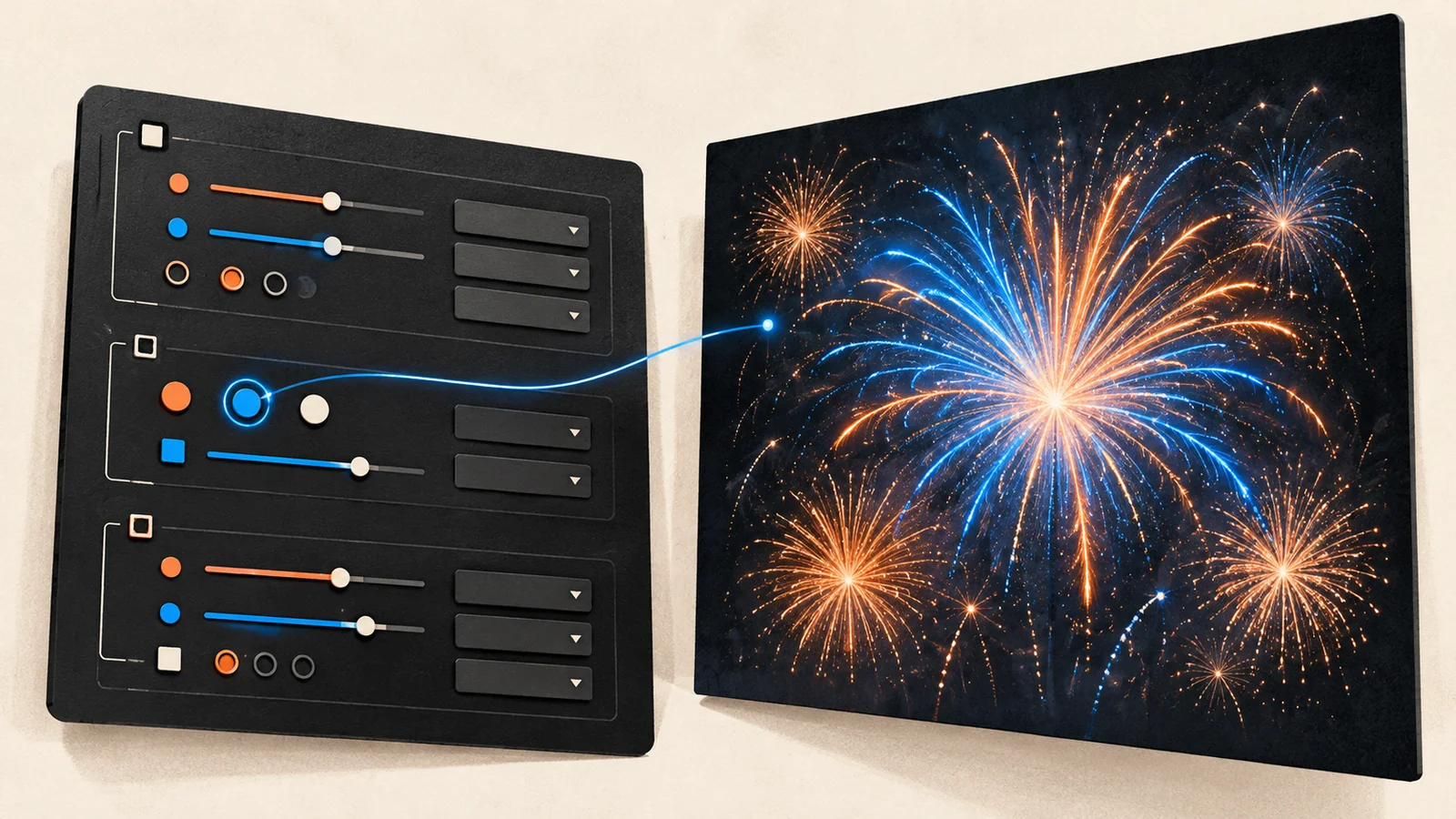
The configuration and API guide keeps that object structure and places editable controls where the values belong.
The displayed defaults provide a starting point. Help sits beside the relevant setting. A dropdown exposes the available choices when a field has a defined set of options.
Take a real example: sound.boomStyle.
It lives inside the sound configuration. The choices include classic, deep, artillery, double, rolling, and mixed. The default is mixed, and the help explains that it varies the boom character.
That arrangement answers several questions together. I can see where the property belongs, what choices it accepts, its default, and what a choice means. I can change it without leaving the explanation behind.
It also shows why structure matters. Choosing a boom style is only part of configuring sound. Sound starts disabled in the displayed defaults, so selecting its character and enabling it are separate decisions. A useful reference helps someone connect those conditions instead of leaving them to wonder why changing an apparently valid value produced silence.
This is the level at which documentation becomes interesting to me. A property has a definition, but someone is trying to achieve an outcome.

Keep the choices through the next step
The guide includes a “Try this config in the Workbench” action.
That connection matters as much as the controls.
Someone has spent time understanding settings and making choices. Asking them to reconstruct those choices in a separate tool would waste part of that effort. The guide's handoff passes the edited configuration into the configuration workbench, where it can be applied to the preview.
The configuration is the connection between reading and experimenting.
For fireworks, the result supplies information that text alone cannot. A description can explain a visual setting; seeing the effect helps someone decide whether it produces what they wanted. Sound settings make an even more obvious case for trying the result.
A useful experiment might be quite small: change one setting, compare the result, restore the baseline, and try another. That gives the reader a way to build understanding without changing six unrelated things and guessing which one mattered.
The same approach could suit chart builders, animation systems, themes, and other tools where settings produce something a person can inspect.
Seeing everything can still be too much
A complete configuration solves a structural problem. It can also present a lot of decisions.
I wanted detailed controls in the workbench. I also found that even a well-organized tab could contain more than someone wanted to deal with at once. That led to the guided approach.
Sometimes I want to adjust a specific property. Sometimes I want help getting to an effect without learning the entire engine first. The same person can want both experiences at different points.
A guided route can begin with an outcome and introduce the relevant choices. The detailed controls let someone go further. The object view provides a way to understand what the configuration contains.
Those routes need to agree about the result. If moving between them changes or discards a choice, that should be visible. A simpler interface earns its place by making the task easier to understand.
This also explains why I wouldn't replace every documentation page with one enormous interactive object. The right entry point depends on what someone already knows and what they came to do.
Put help where the uncertainty appears
Contextual help works best when the short explanation answers the immediate question and a longer explanation is available when needed.
In the configuration editor, the help control can expose more detail in a dialog. That leaves room for information that would be awkward to squeeze into a tooltip: available choices, defaults, relationships, and examples.
The interaction itself needs care. Someone using a keyboard or a touch screen should be able to reach the same useful information. Help that disappears while someone is trying to read it creates another obstacle.
W3C's guidance on hover and focus content addresses that problem through conditions for dismissing, reaching, and keeping additional content visible. These are practical design considerations for anyone putting explanations into an interface. Understanding Content on Hover or Focus.
Controls help with errors; explanations help with decisions
A dropdown removes the need to type an option name. A numeric field can check whether the entered value is a number. The editor can identify an invalid field before passing the configuration onward.
Those checks are useful, but they answer narrower questions than “is this a good configuration?”
Two individually valid settings may produce an effect the user doesn't want. A demanding configuration may be inappropriate for a particular device. A technically valid value can still be surprising.
That is where explanations, sensible defaults, and a preview belong together. Controls can prevent some input mistakes. Documentation can explain consequences. Experimentation can help the reader choose.
The reference now has behavior to maintain
Once a documentation page edits values and sends them to another tool, it has become part of the product's behavior.
Its defaults need to agree with the engine. Its choices need to match the supported options. Its handoff needs to preserve the configuration. Its errors need to help someone recover.
There is maintenance work here. Copying defaults and descriptions into several places creates opportunities for drift. A shared definition can reduce duplication, and checks can catch differences when the engine changes.
That is part of the cost of the approach. For a small library with two options, a clear example may be all anyone needs. For a library where configuration is a substantial part of using it, making that configuration understandable deserves engineering attention.
After the demonstration
The appeal of this approach is specific. It reduces the assembly work between reading about properties and trying a complete configuration.
I want someone to see the shape of the object, understand the settings that matter to them, make a change, and inspect the result. I want a guided route when the full set of controls becomes too much, and a detailed route when the reader is ready for it.
The project started with a song, Joely's inspiration, and the determination to make something exceptional. Making the engine useful to someone else became a design problem of its own, and deserved the same care.

That is the question I would put to other library authors: after someone enjoys your demo, how easily can they make something of their own?