
“Your website looks dated” gives a firm very little to decide.
Which part of the experience needs attention? Who encounters the problem? What does it prevent them from doing? What is worth preserving?
A visual concept can make a proposed direction easier to discuss. An audit should explain why that direction deserves consideration.
That is what I want from the legal website reviews I have been developing through DocketScore at Counsel Creative: a clear account of the experience a prospective client encounters, followed by practical priorities.
The score should help someone understand that account. Its value depends on the explanation behind it.
Begin with the visitor's task

A law firm's organization chart is rarely the same thing as a visitor's question.
Someone may be trying to understand whether the firm handles an employment problem. A business owner may need help with a transaction. Another visitor may already know the lawyer they want and simply need a phone number.
The site has to support those tasks without requiring everyone to understand the firm's internal structure.
That gives the review something concrete to examine. Can someone identify the relevant service? Does the language make sense without professional knowledge? Can they find an appropriate person? Is the first step understandable?
Presentation affects those answers. Type, contrast, spacing, imagery, and visual hierarchy influence what a visitor notices and can read. Aesthetic judgment belongs in the review, connected to the audience and the task.
An older visual style can still contain useful content and effective routes. A polished homepage can leave basic questions unanswered. The reviewer needs to recognize both.
Use categories to look beyond the homepage

DocketScore organizes the assessment around ten areas:
- Visual presentation.
- Branding and logo.
- Service clarity.
- Calls to action.
- Trust and credibility.
- Mobile experience.
- Navigation and usability.
- Content and messaging.
- Local search readiness.
- Technical performance.
Each asks a different question about the website. A strong photograph shouldn't conceal confusing service descriptions. A slow page shouldn't erase the value of good content. An established logo shouldn't lose credit merely because the reviewer prefers a newer style.
Accessibility crosses several of these areas. Readable content, understandable labels, keyboard operation, and usable contact routes affect the experience throughout the site.
The categories help keep the review broad enough. The findings make it useful.
Follow one finding from observation to recommendation

Here is a fictional example, with an illustrative category score.
A firm offers employment services. On the reviewed mobile pages, a visitor can read about dismissal and workplace disputes, but the relevant pages offer no direct next step. The route to an enquiry is through the main menu. The contact page uses a general form and gives no explanation of what follows submission.
A useful finding could read like this:
| Part of the finding | Example |
|---|---|
| Category | Calls to action |
| Illustrative score | 4/10 |
| Observation | Reviewed service pages have no direct enquiry action; contact is reached through the main menu. |
| Strength | A contact route exists and its form is available. |
| Issue to resolve | The service information and first enquiry feel disconnected. |
| Recommendation | Add a clearly labelled enquiry route near the relevant content and explain the firm's agreed first-contact process. |
The number summarizes the assessment. The observation and recommendation explain what the firm can do with it.
The score is illustrative, and a real assessment would consider the rest of the reviewed evidence. The example makes no claim about abandoned enquiries or lost revenue. Establishing either would require different information.
Design the response around the finding
A concept can now show how the recommendation might work.
On the employment page, a clearly labelled action could sit near the service explanation. Its destination could preserve the context of the enquiry, so the visitor doesn't have to start again. The contact page could explain who receives the message, what information is useful initially, and what response to expect.
Those details need agreement from the firm. A designer shouldn't invent a response-time promise or remove an intake requirement without understanding its purpose.
The form itself needs examination. Which information is necessary at first contact? Which details can wait? Are instructions and errors understandable? Is the route usable on a phone and with a keyboard?
Now there is something specific to evaluate. The firm can examine a proposed journey from service information to enquiry, rather than judge a homepage in isolation.
After implementation, check that journey. Can a visitor find the action, complete the required fields, submit successfully, and understand the confirmation? Does the enquiry reach the intended destination through an authorized test?
A concept can demonstrate an intended route. Those checks establish whether the implemented route works.
A complete score needs complete support
Every published category score should be numeric and backed by enough evidence to justify it.
Missing information is an unfinished part of the review. It shouldn't become an empty score, a default number, or a zero used to fill the gap. The reviewer needs to obtain the missing evidence and resolve the assessment before presenting it as complete.
That requirement also makes the scope important. The report should identify the pages, devices or viewing conditions, and tasks it covers. It should distinguish a directly observed problem from a recommendation that needs further discussion.
For example, a mobile screenshot can support a finding about what is visible in that view. Checking keyboard behavior requires interaction. Seeing a form doesn't establish that submission and delivery work.
A report earns confidence by connecting its conclusions to the checks that support them.
The overall score needs that same discipline. It should summarize the completed assessment using a consistent method. Its meaning shouldn't change quietly from one report to the next.
Audience routes should make the choice easier
A firm may serve individuals, businesses, unions, institutions, and prospective employees. Those audiences can have different reasons for visiting.
Separate routes can help when the differences are meaningful. They can also create another obstacle if visitors must classify their problem before seeing useful information.
Someone with a workplace dispute may not know the legal term for it. A business owner may need several services at once. A visitor shouldn't have to guess the firm's preferred category to find help.
I would examine the labels, the service explanations, the routes to relevant people, and the options available to someone who is unsure.
Some firms will benefit from clear audience entry points. Others will be easier to navigate with a simpler service structure. The right choice follows the practice and its visitors.
Prioritize by consequence and dependency

An audit can contain dozens of valid observations and still leave the firm unsure where to begin.
The order of work needs judgment.
A broken enquiry form deserves attention before a decorative refinement. Confusing service descriptions may need rewriting before the navigation can be settled. A platform limitation may affect which improvements are practical.
Priority depends on the visitor's task, the severity of the obstruction, how broadly it occurs, and what other work depends on the correction.
The lowest category score doesn't automatically identify the first task. A category can contain several modest weaknesses, while another contains one broken route that needs immediate attention.
A useful report explains that distinction.
It should also identify what to keep. Recognizable branding, useful content, clear contact information, and established URLs can all deserve preservation. Replacing them without understanding their role can create avoidable work.
Let the firm examine the proposed answer
This is where a navigable concept becomes valuable.
The firm can move through the proposed pages, examine the mobile presentation, and see how a recommendation changes the visitor's route. Discussion becomes more specific: is this service description accurate, is this next step appropriate, does this structure fit the practice?
The audit provides the reasons. The concept makes the proposed response easier to assess.
That connection should remain visible through delivery. If a redesign recommendation addresses an identified problem, the completed work should be checked against that problem.
Give the recipient something they can act on
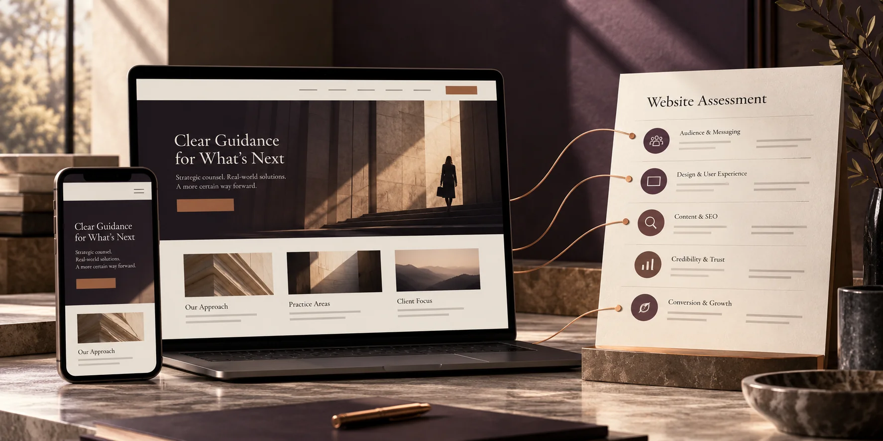
A website audit should help a firm make decisions even if it chooses someone else to carry out the work.
It should explain what was reviewed, what works, what needs attention, and why the recommended order makes sense. It should make room for the firm's constraints without treating every preference as a failure.
A low website score concerns the reviewed experience. A high score needs the same explanation. Neither replaces an understanding of the people, services, and business behind the pages.
When someone asks why a category received its score, the report should lead them back to observable details. When they ask what to do next, it should give them a practical starting point.
That is the standard I want the number to serve.